Form Builder
Tutorial
In this video you will learn how to create forms in Form Builder.
Form Builder Interface
Form Builder interface has the following appearance:
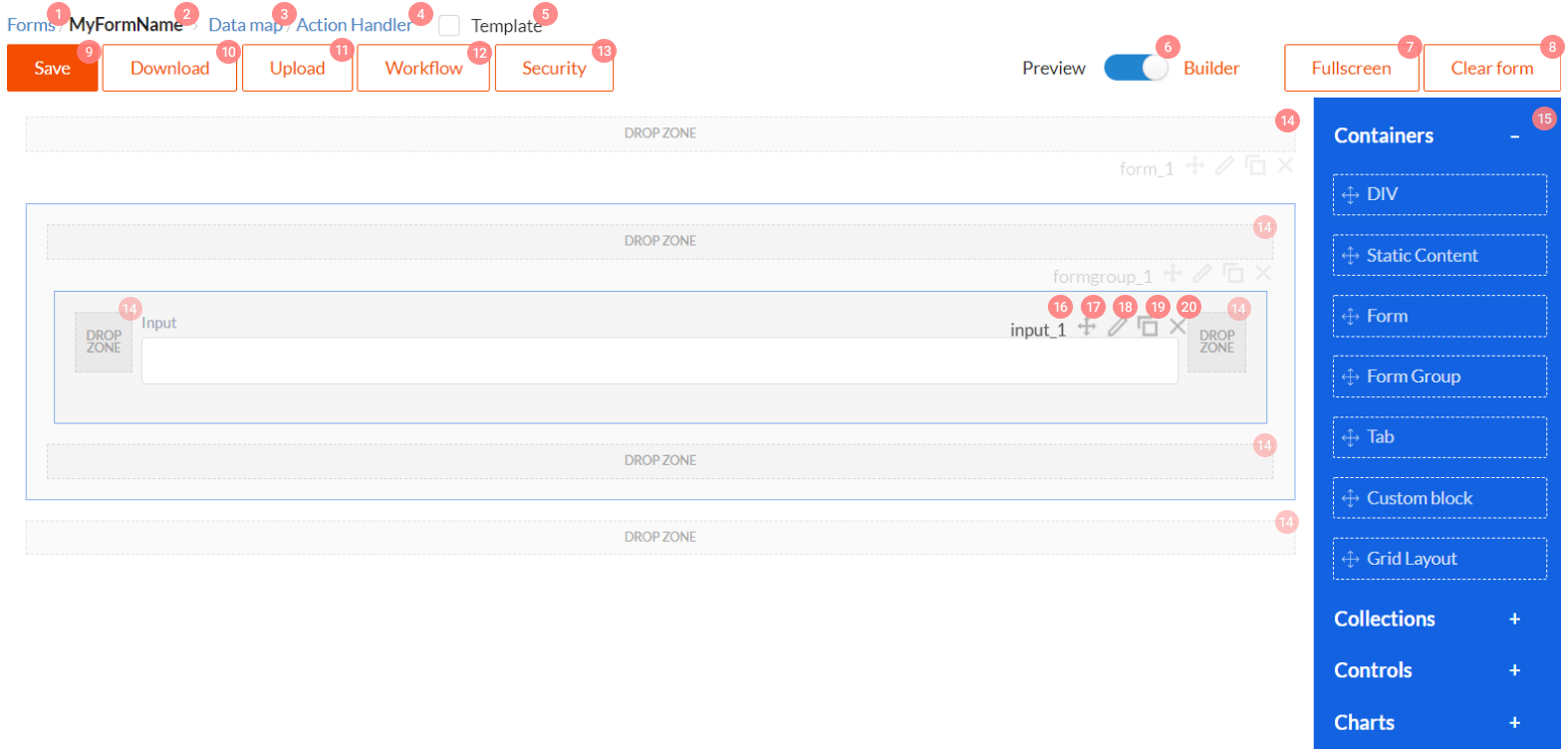
Its control elements have the following functions:
- Link to the list of all forms in the system.
- Opened form name.
- Link to the open form and data mapping. Learn more.
- Link to the opened form action handlers. Learn more.
- Indicates that this form is a template and can be embedded into other forms. Learn more.
- Toggle between form edit mode and form preview mode.
- Form Builder full-screen mode switch.
- Form erasure, i.e., deleting all form elements.
- Saving forms to server.
- Downloading form layout as JSON file.
- Form upload from JSON file.
- Opens window for editing form link to one or several workflow schemes. Learn more.
- Opens window for editing form link to a group of permissions. Learn more.
- Dropzones. You will drag and drop components from panel 15 to these zones, when editing a form.
- Component panel. Drag components from here to dropzones 14, when editing a form. We will define each component and its properties in documentation below.
Elements 16 - 20 are control menus for each component. There are similar component menus in forms.
- Displays component Name property.
- Control element with which you can drag component to any dropzone.
- Click this button to open property editing window for each component.
- Component copying button. Copied element will reserve all settings, but will have a different
Nameproperty value. - Click this button to delete component from form.
Component properties editing interface
When clicking component properties editing button 18 component properties window will open. See picture below.
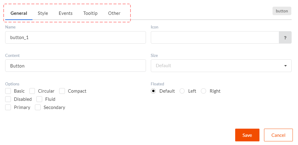
Some properties are unique for each component, some are general. All common properties are described here. All tabs divide component properties into the following groups:
- General - basic component settings which define its behavior and appearance.
- Style - component css styles settings.
- Events - defines which actions will be called upon certain component events.
- Tooltip - tooltips display settings. Tooltips are used as help and to display validation errors.
- Other - here you can set client validation, component visibility and component editability functions.
Component types in DWKit
There are four basic component types in DWKit.
- Containers - components which can contain other components. For example, tabs, forms and other layouts.
- Controls - form basic components. For example, inputs, dropdowns, headers, dictionaries.
- Collections - grid-like components which display multiple records.
- Charts - report display diagrams.