Form components common properties
In this section, we'll describe common component properties.
General Tab
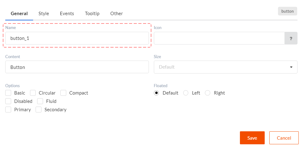
In this tab you can see component general settings which define its behavior and appearance. Only one property in this tab is common for all
components. It's Name. Name sets a unique component ID in a form. Please, keep in mind that you might use this value in JavaScript code
to get access to data. For example, data.myComponent_1 = ...;. That is why it is not recommended to assign IDs with gaps and special
symbols to components. The best option will be a combination of letters, numbers and the '_' symbol.
Style Tab
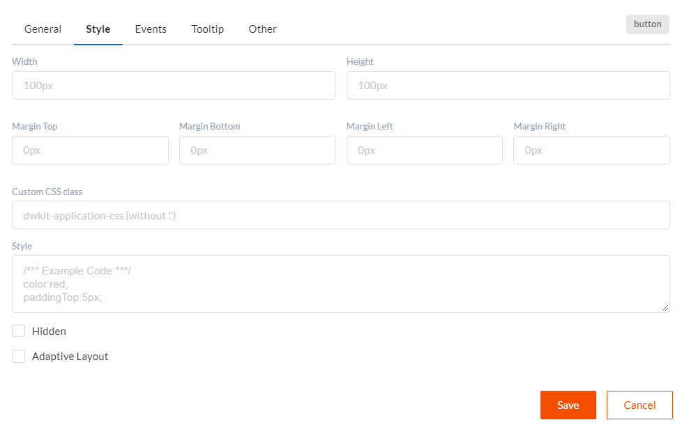
In this tab you can see css styles settings for components. We've got the following property values here:
- Width - component width - values in pixels (px) and per cent (%) are allowed.
- Height - component height - values in pixels (px) and per cent (%) are allowed.
- Margin Top, Margin Bottom, Margin Left, Margin Right - margin values in pixels (px) or per cent (%).
- Custom CSS Class - css class name, which will be applied to component, without a "." symbol in the beginning of the name.
- Style - use this property to fully customize component style, see React Documentation for syntax reference.
- Hidden - this element is presented on the page but is hidden.
- Adaptive layout - includes access to additional settings to implement adaptive layout.
Events Tab
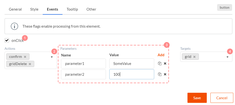
You can set component event handlers in this tab. There can be different events for different components, but info structure in this tab is always the same.
- Checkbox which turn on sending (and of course handling) certain events.
- Field in which you can set a chain of client or server actions, which will be handling this event. You can learn more about event handling chains here.
- Parameters which are transferred to all actions in the event handling chain. It's a simple dictionary with key-value items.
- Component target Name. Here it's a component with which event will be called. For example, for the "Delete record from grid" button, grid will be its target component.
Tooltip Tab
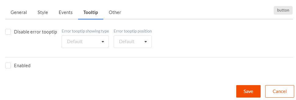
In this tab you can set tooltips which display validation errors connected with a certain component, or other relevant information (for example, help). This tab is the same for all components.
- Disable error tooltip - if this checkbox is checked, tooltip with error text will not be displayed for the current component.
- Error tooltip showing type - defines under which conditions tooltip will be shown. Hover - when pointing over the component by mouse cursor. Click - when clicking the component. Focus - when setting focus to component. Default value is Hover.
- Error tooltip position - sets where tooltip will popup. Default value is Top Left.
- Enabled - if this checkbox is checked, tooltip with additional (help) information will be displayed for the component.
- Tooltip Header - tooltip header text with additional info.
- Tooltip Content- tooltip content text with additional info.
- Class name - style name (without a "." symbol in the beginning of the name), applied to the tooltip with additional info.
- Tooltip showing type - defined under which conditions tooltip with additional info is displayed. Hover - when pointing over the component by mouse cursor. Click - when clicking the component. Focus - when setting focus to component. Default value is Hover.
- Tooltip position - sets where tooltip will popup. Default value is Top Left.
Other Tab
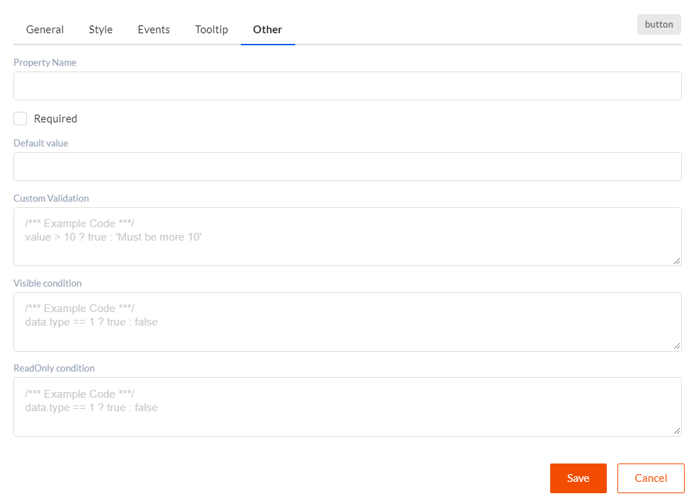
In this tab you can set client validation, content visibility and content editing functions. This tab is the same for all components.
- Property name - usually component is bound to data by component Name property
during data mapping. However, if you set Property name for the component, it will be used for
data mapping. I.e. you will find Property name property in the
dataobject. - Required - if this checkbox is checked, this field (if this is a user input component, for example) is required. Client validation will be executed when using it.
- Default value - default value transferred to component as data.
- Custom validation - function which must return
true,falseor validation error text.falseor error text means that validation failed and relevant validation errors will be displayed in form. - Visible condition - function which must return
trueorfalse. If this function returnsfalse, this component will be hidden in form. - ReadOnly condition - function which must return
trueorfalse. If this function returnstrue, this component, this component will be unavailable for editing in form. You can use the following elements in these three functions:data- form data object.checkRole('rolename')- function for checking authorized user's role.checkPermission('permission')- function for checking authorized user's permission.DWKitApp.API- client DWKit API object access.