Adaptive layout
You can perform adaptive layout in DWKit. When the same form looks different on various devices with wide screen (computer screen width is >= 998px) and mobile devices (smartphone screen width is < 998px). This functionality is supported by three tools:
- Special styles for adaptive layout.
- Writing additional styles applied in mobile layout only.
- Specifying for component in which mode (mobile or desktop) it will be rendered.
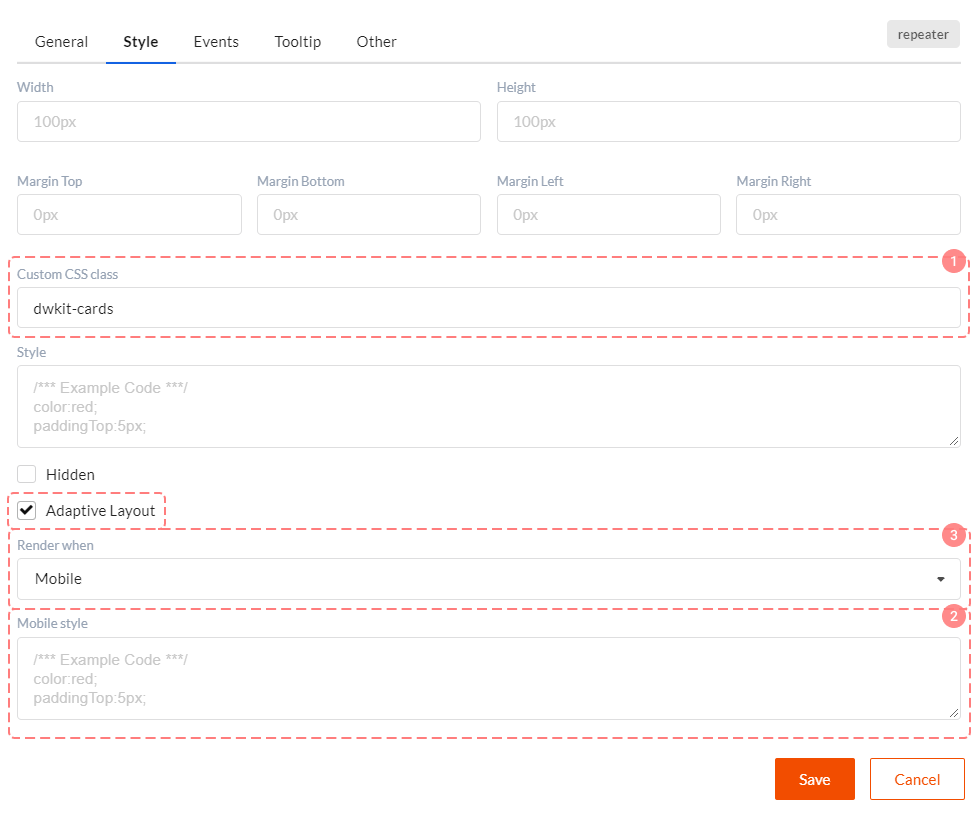
All tools are applied in component settings in the Style tab.
Tool 1. Special styles for adaptive layout
Styles for adaptive layout must be written in the Custom CSS class property of component settings. All these styles are specified in the wwwwroot/css/dwkit-style.css file. Here are several styles you'll need:
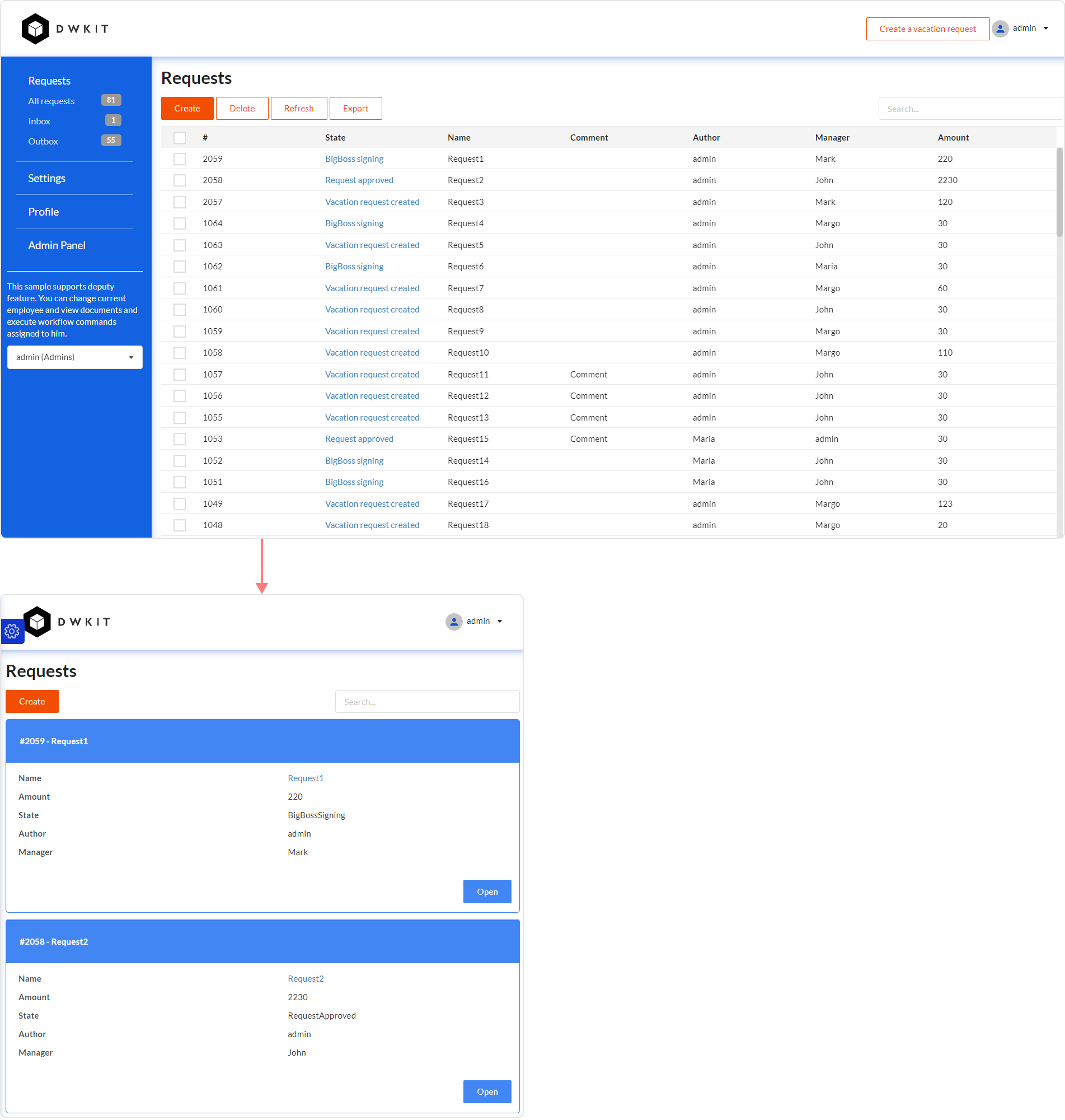
dwkit-notmobile- component will be hidden in mobile layout. We do not recommend to use it if you have many of these components. In this case we suggest you exclude them from render (see below).dwkit-buttons- style for container with buttons.dwkit-blocks- style for container with adaptive layout blocks. See what they look like and how they can be applied in this form. All main document fields here are placed into blocks which change their position depending on screen width.dwkit-block- block style. Block itself is container for other elements (inputs, for example).dwkit-cards- style for card container displayed in Repeater component. Is applied directly to the Repeater component. See what they look like and how they are applied in this form. Find 'gridHistoryMobile' component in it.dwkit-card- style of container with card elements. As a rule DIV component for which style is written is placed directly into Repeater.dwkit-card-header- card header style. We recommend writing this style in DIV, and then you can place components which display the header into this div.dwkit-card-body- card body style. We recommend writing this style in DIV, and then you can place components which display the card content into this div.
Tool 2. Additional style for mobile layout
To use this style check Adaptive layout checkbox in the Style tab. You will see Mobile style field in which you can write additional styles for mobile layout.
Tool 3. Rendering management
To use this style check Adaptive layout checkbox in the Style tab. Next select Render when property values. Three options are available here:
- Any - component will always be drawn.
- Mobile - component will be drawn only for mobile devices (smartphone screen width < 998px).
- Desktop - component will be drawn for wide screen devices only (computer screen width >= 998px).
Why do we need this? Well, not all components can be displayed in mobile layout with the help of styles. For example, we want to see grid on the wide screen and entity cards set on the mobile screen. To demonstrate this open this form. Next start narrowing browser window horizontally. At some point grid will turn into cards set. It means that Grid View component is drawn for wide screen and Repeater for mobile mode.
The great advantage of this approach is that the component rendering is controlled by screen width. I.e. there will be only one heavy component in the form.
Adaptive layout and data mapping
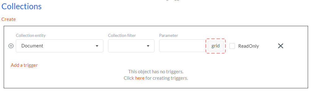
When there are two collection components in one form which display the same data set, we've got two options how to perform data mapping in this case:
- Specify one random collection component in the collection mapping. For example, Grid View with 'grid' name. Then for the other Repeater component write 'grid' value in the Property name in the Other tab. This approach was applied to the Documents form.

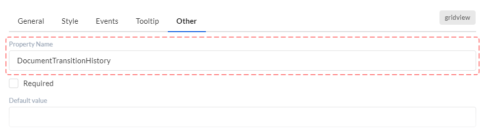
- Do not specify anything in the collection mapping. Write name of Data model displayed in collection in Property name in the Other tab for both Grid View and Repeater components. This approach was applied to the Document edit form for 'gridHistory' grid and 'gridHistoryMobile' repeater.
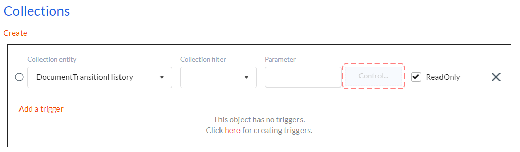
Pay attention to the fact that in both cases column names in grid and input names in repeater must coincide! It is required for correct mapping.